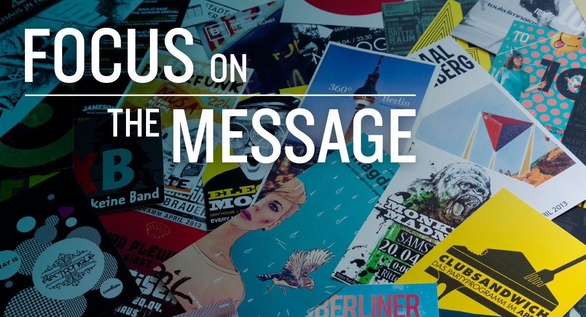
Think about your favorite podcast. If we had to guess, it probably involves a host or small group, each speaking in turn to deliver a clear point or message. Now imagine your favorite podcast if everyone spoke at the same time, at the same volume, saying different things. It would be confusing, wouldn’t it?
Unfortunately, this situation happens in the design world all the time. Too often, we see designs that are cluttered, confusing and delivering too many messages — or none at all. How can we fix this? Through understanding visual hierarchy.
The foundation of visual hierarchy focuses on prioritizing content. Before starting a design, the most important part of the message must be chosen. Is it the headline? The call to action? The image? Only after this is decided can we use the principles of visual hierarchy to guide viewers’ eyes to the elements we want them to see, in the order we want them seen.
If this sounds a little foreign to you, that’s because visual hierarchy often gets pushed aside in favor of other tactics. In our society of overstimulated viewers and overstuffed ads, too many marketers rely on “bigger” and “louder” content to get their messages noticed, resulting in more clutter in the marketplace.
Luckily, it doesn’t have to be like this.
Three concepts to keep in mind when establishing visual hierarchy are space, size and scale and alignment. The targeted use of these techniques can allow you to hack into the human psyche to get real attention — and help move audience members toward actionable results.
Negative Space is a Good Thing
Negative space (sometimes called “white space”) can be an incredibly effective tool in drawing attention to the right places. The assumption that an abundance of space will make a page look “empty” is completely false; in fact, designs that lack this space can result in chaos and confusion.
Consider this example:
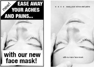
Both designs promote a soothing face mask. However, the example on the left isn’t soothing at all — the cluttered, capitalized words coupled with the harshness of the boxes make the ad seem like it’s almost yelling at viewers. Meanwhile, the option on the right provides plenty of negative space. It removes the sharp boxes and offers space between the letters, adding an almost airy quality to the words. It’s soothing, quiet and relaxed – exactly how you want the viewer to feel when considering a purchase of this face mask.
Sometimes, it’s not about what you can add to a composition, but what you can remove to make the message clearer and more effective.
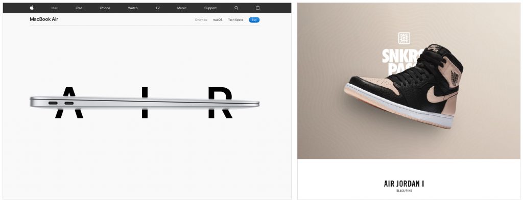
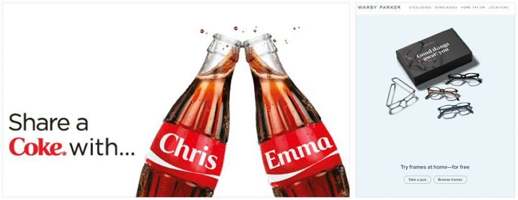
Here are some brands that effectively utilize white space in their branding:
Bigger isn’t Always Better
The size and scale of elements can drastically impact the effect your design will have on viewers. While it’s true that larger elements attract more attention than smaller elements, that doesn’t always make it the right choice for your design. If every element is large, the viewer can’t differentiate what’s important from what isn’t. This is when scale comes into play.
Consider this example:

Everything in this ad is the same size, which causes confusion in the viewer’s brain. Where should you look first? At the car? The zero? The $69? Meanwhile, the smaller items are barely legible, causing frustration and eye strain.
Our brains are much lazier than we believe. When we see a design, we want to be eased into it, and told where to go. Size and scale help us know where to start this journey and guide us to the next part of the message.
Here is an example that utilizes size and scale in a much more effective way:
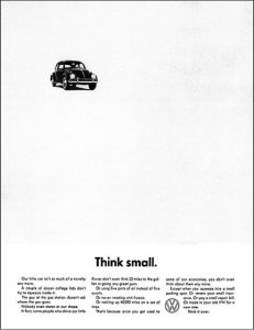
This famous ad works because there is harmony between what we see and what we read. We first notice the small size of the car, then read the headline: “think small.” Now, we’re intrigued: why should we think small? At that point, we read the supporting copy and see Volkswagen’s logo.
If everything in this ad had been the same size, this experience would not have occurred. We may have become confused and read the supporting copy first, or seen the logo and thought, “I don’t want a Volkswagen, this ad isn’t relevant to me.”
It is important to note that the size and scale of the car not only grabs attention, but also supports the overall message the company is trying to send – that the car is smaller than other vehicles on the market.
The smartest way to find success when thinking about size and scale in design is to set a goal before the design process begins. What do you want the viewer to see first? That element should be the center of attention and a thoughtful strategy should be built to support the effort.
Avoid Arbitrary Alignment
Alignment is where items are placed on the page in relation to other objects. Ideally, you want the reader’s eye to scan the items easily, in the order that you dictate.
For alignment to aid your design, you must be purposeful. Notice the alignment of the image below:
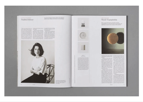
Everything on the page shares the same margin. The text is aligned to the images, and the images are the same width as the columns and headlines. This particular example is both horizontally and vertically aligned, adding a sense of purpose, order and cohesion to the entire page.
Thoughtful alignment helps viewers digest your message more easily. There are fewer distracting elements in a well-aligned piece, and the eye knows exactly where to go to find additional information.
As we’ve seen, using hierarchy to organize your designs can create a world of difference for your viewers. Through the use of negative space, correct size and scale and perfecting alignment, your design can turn heads — and make certain that your message is as clear as possible to encourage future action.